Composition in the Arts: How to plan a Drawing or Painting
I don't know about you, but when I hear the word ‘composition’ the first thing that pops into my mind is where to place the old-timey bottle of red wine in relation to the bowl of fruit in a still life.
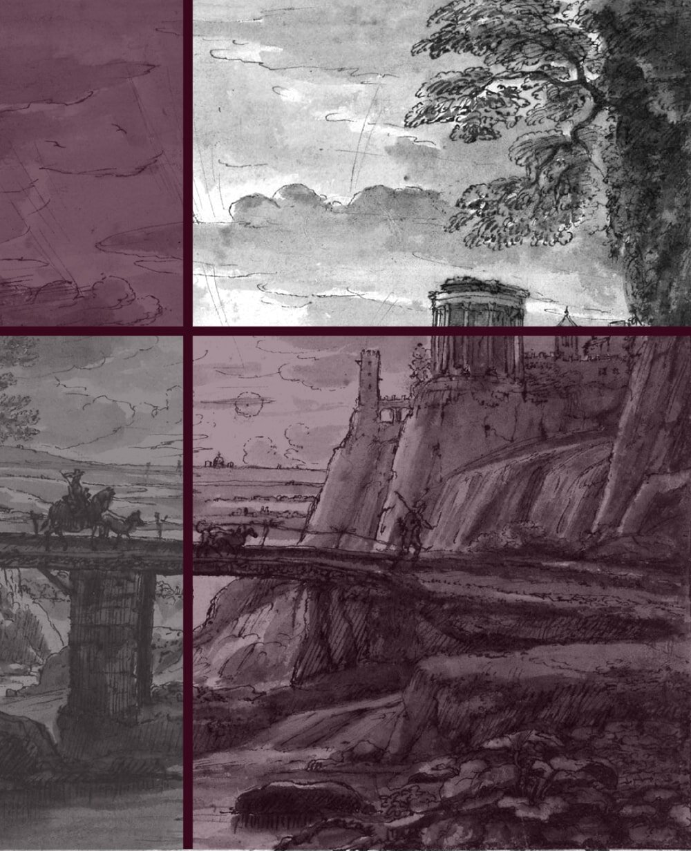
But obviously the topic of composition in the arts is a lot more comprehensive and important, not just for still lifes but also landscapes, architecture sketches, portraits, even abstract art, as already introduced in my post on how to beat blank page syndrome in the arts.
Edward Hopper’s ‘Nighthawks‘ (1942) is an example of a highly calculated and successful composition
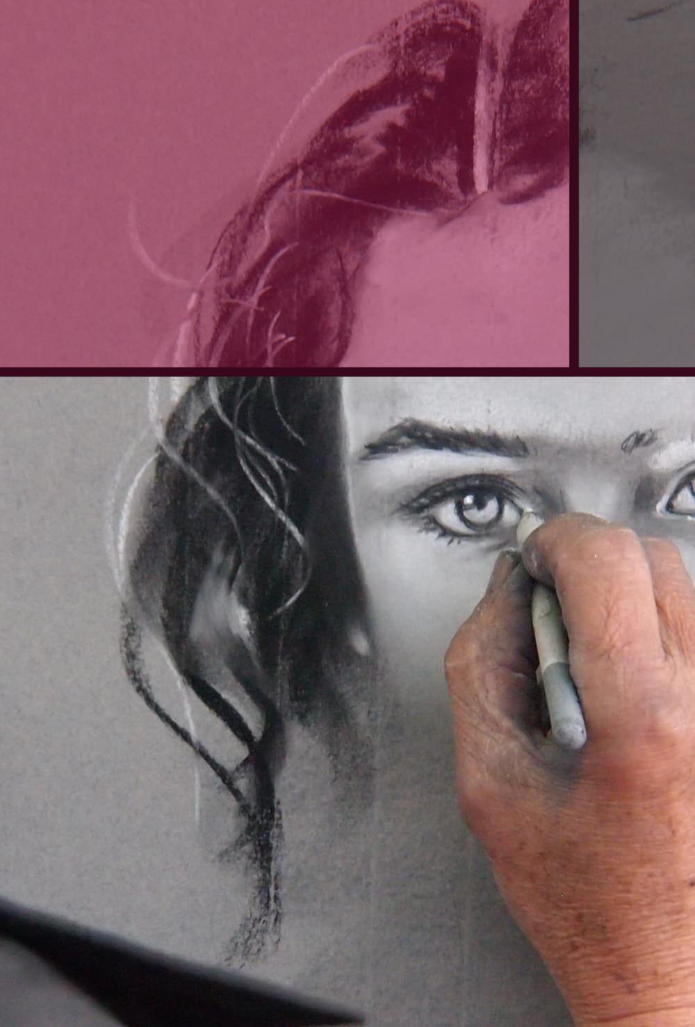
All great artists, professional and hobbyists alike, put a lot of effort into planning their major pieces. You'll find that many the most regarded drawings and paintings have been thought through down to the very last detail and nothing was left to chance.
A piece of art does not start with the first pencil mark or brush stroke, but long before that. Once the artist has decided on the general subject they will work out how to best portray it.
This includes what part of the subject to display, from what angle, what medium and style to use, which design rules to follow (or break) and much more.
A painting does not start with the first brush stroke, but long before that, when the artist works out the composition.
New and aspiring artists often make these decisions subconsciously. However, most of us aren’t born with an intricate knowledge of how to plan an interesting and successful composition; it’s a skill that has to be trained and refined.
What is composition?
Such a simple word, such a complex topic. The short version: composition is what you show your viewer, and how you show it to them.
This includes more than just the arrangement of parts of your subject, such as whether to draw that bottle of red wine next to or behind that bowl of fruit or where to place the people in this beach scene.
And it’s by no means something that only master artists should concern themselves with. Composition involves advanced topics like angles and geometry, just as well as very basic decisions on cropping and choice of colour.
Composition is not just a topic for the great masters. Even beginners make decisions on composition all the time, whether they’re conscious or not.
If you're drawing a still life and your general subject is a table with a fruit basket on it, you will need to decide what parts to leave out (such as the legs of the table) and what parts to show (such as the fruit).
You’ll want to think about what part of the subject you want to be your focal point and from what direction and angle you want to draw it.
Literally any decision you make can steer the viewer towards certain thoughts and conclusions and even the smallest detail can entirely change the artwork’s feel and message. No pressure though!
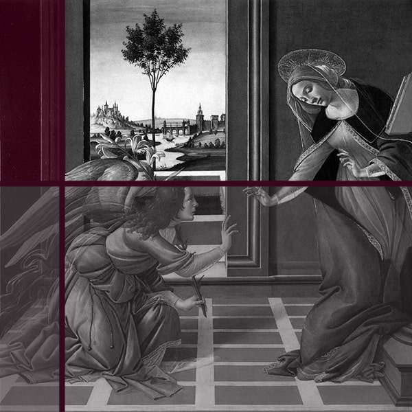
Nothing is accidental in Botticelli’s The Annunciation (ca. 1490)
Another important decision that especially the painters of old put great emphasis on are mathematical design rules, such as the rule of thirds and the 70/30 rule (more on those below).
Colour theory, if your work has any colour, can also play a major part in relaying the message you want to convey. So does the style of your work, shading, linework and so forth.
All this sounds terribly complicated, but trust me, many people have a natural knack for it and do it intuitively. And everyone else can learn it with some simple rules.
Choice of subject
As with all things in life, tastes differ. Some artists feel inspired by an old scrappy pair of boots, others by a beautiful sunset over the sea or a pretty girl whose hair is flowing in the wind.
There is only one ultimate rule here: If you want to create an interesting piece of art you have to pick a subject that interests you yourself.
Drawing a fruit basket when you're not the least bit intrigued by those apples and grapes is a waste of time and talent. You simply cannot make good art if you don't care about what you're drawing.
Creating art is about making others see what you see, and if that's 'boredom' then that's what your finished work will express to the viewers.


Find something that you actually want to draw, and then bring it to life on your canvas. But I will say this much: sometimes it's worth giving a subject a little consideration before discarding it as dull.
It might sound deadly dry to draw a pair of boots for example, but looking at them closely, the shape, the material, the subtle abrasions can actually make for quite an intriguing motive.
Follow these links for more specific landscape, still life, portrait or architecture-themed composition tips.
Cropping
When you look at your subject, be it a landscape, a still life or a person, you inevitably see more than you can (or may want to) include in your final drawing.
Because of the way human eyes work, we can see not only what's directly in front of us but also things that are slightly to the side, above or below. The canvas however is a limited, flat, 2D surface.
If you're looking at your back garden, for example, you'll need to decide what parts of it you’ll want to draw. That may be just the little pond with the shrubs around the edges, or it may be the entire area from one side of the fence to the other.

Van Gogh’s Still Life with onions (1889) interestingly crops out parts of the bottle on the left and coffee pot at the top.
This choice will automatically affect your focal point (the ‘main event’ you want the viewer to notice).
If you draw the entire back garden, perhaps you’d like the pond to be the focal point, because it naturally sticks out as an interesting feature. If you only draw the pond however the focal point would be a part of it, such as the patch of water lilies perhaps, or the little waterfall.
It can often make for an intriguing design if parts of a whole are cropped. You may, for example, only show parts of the entire fruit basket, instead of the whole thing, or only the upper torso of your model, rather than head-to-toe.
If you find it difficult to decide on a good cropping the easiest option is to simply use your two hands to create a square through which to look and move it around, further and closer to your subject to see which view works best.
Of course you can also buy a viewfinder or just make one yourself out of cardboard.
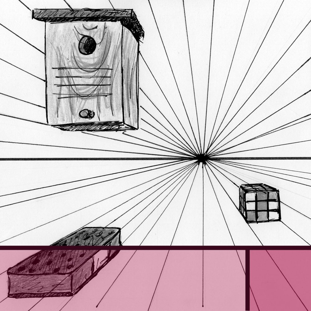
Viewpoints
The angle from which you show your scene, whether from above, below, close-up or from a distance has an enormous effect on how the viewer will relate to it.
If my subject is a family having a pick-nick in the park I can make the viewer feel like they're part of the scene, by showing it close-up and from an eye-level view (head on).
By contrast, if I want the viewer to feel like a simple observer, I can show the family from a bit further away and sitting below the viewer's eye-level (birds-eye-view).


While a beginner artist should by no means overcomplicate things and think too much about what they might draw and how they might draw it, it's always good to have some basic connotations of different views and angles in the back of one's mind.
In fact, especially when a subject has been drawn many times before (such as the obligatory fruit basket), using a different view can make the finished piece much more interesting, despite the ‘dull’ topic.
Mathematical design rules
We won't go into too much detail here as it's quite a complex topic that we could talk about for weeks. For beginners and hobby artists it's perfectly fine to be aware of only some key elements and worry about the finer details at a later stage.
Once the artists of old had come up with some basic geometric rules to create balanced and pleasing compositions there was no going back. In fact, we still use them today, sometimes intuitively, sometimes deliberately.
One of the most used design rules in art as well as photography is the Rule of Thirds.
The Rule of Thirds as shown on Turner’s ‘The Fighting Temeraire’
The canvas is divided into nine parts, three horizontally and three vertically. The focal point, and often the horizon, are placed on the imaginary division lines or their intersections, rather than directly in the middle of the canvas. This often makes a piece more interesting.
Another popular design principle is the 70/30 Rule. Differences and opposites add interest, in life as in art. This principle dictates that there should be a difference between one bigger part of your artwork (70%) and one smaller part (30%).
This difference can be all sorts of things, such as small shapes vs big shapes, detailed drawing vs rough filler, straight lines vs curved edges, dynamic composition vs resting state and so on.
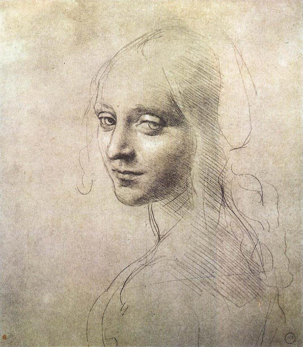
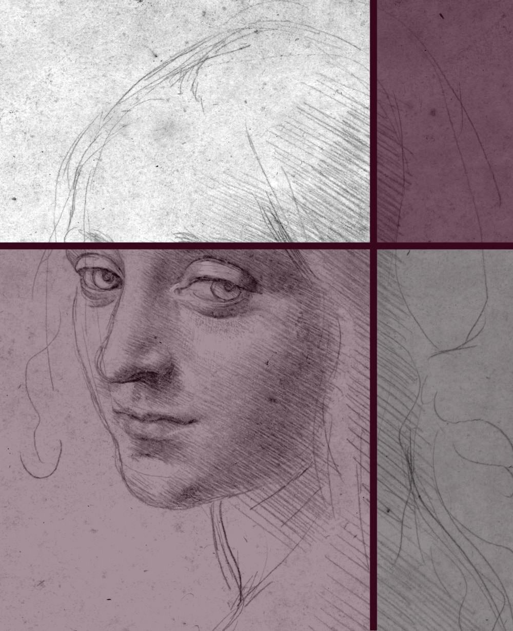
The 30/70 Rule in da Vinci’s Head of a Girl. 70% of the drawing is background or rough sketch and 30% is intricate detail.
Naturally there are many other, far more complex design rules out there that the great mathematicians of the past came up with, but let's not overcomplicate things.
Plus, sometimes, in fact, breaking the rules can make for a very interesting piece indeed. If you feel that your focal point belongs bang on in the middle instead of adhering to the Rule of Thirds follow your gut.
Colours
This is another topic that can become as complex as you're going to let it, but for a beginner or hobbyist it's perfectly sufficient to just know some handy basics.
Most of us had at least some colour theory at school. I'm sure you'll remember learning about colour temperature.
Some colours, such as red, orange and yellow have a naturally warm ‘feel’ to them, because they remind us of warm things, like the sun or fire. Others, such as blue, purple or green feel cold because they remind us of ‘cold’ things like grass or water.
But it's not just about the feel. Warm colours tend to stick out in a painting, while cool colours recede (due to aerial perspective giving the illusion that things further away from us become bluer).
Primary colours (pure red, blue and yellow) also tend to be quite the eye catcher. Secondary colours are mixed of two primary colours (so that’s your orange, green and purple) and will blend in a little more. And tertiary colours, which are mixed of one primary and one secondary colour are even less striking.

It's not a coincidence that stop signs are created in warm, primary colours and office carpets or bedroom walls are often in more relaxing, cold colours. And of course this works in art just as well as in real life.
Then there's the broader colour psychology, where each colour has a certain meaning, such as green representing nature and red meaning love or passion.
Do be careful with this though, as that meaning can differ depending on the culture you're in. The colour white in the UK will be seen as pure and innocent, whereas in India, for example, it's closely related to death and is traditionally worn to funerals.
There are complimentary colours, which are opposite each other in the colour wheel. Putting these colours next to each other can create quite dramatic effects, especially the combination of red and green is something that will draw a lot of attention.

If you're looking for more harmony in your artwork you could instead opt for analogous colours, which are next to each other in the wheel, such as green and blue or red and orange.
The difference between hues, shades and tints is where things get super complicated. To be honest most people use them interchangeably, so it’s absolutely not paramount for you to learn their exact meaning at this stage. However, here’s a quick summary for completeness:
Hue: Really just a different word for colour. This includes any colour in the wheel, e.g. red, orange, burgundy, but not black or white as they’re not in the wheel. Those colours are all pure and more or less vibrant, depending on whether it’s a primary, secondary or tertiary colour.
Shade: Any hue/colour with black added, making it darker and more dull.
Tint: Any hue/colour with white added, making it lighter and more pastel.
Tone: Adding white and black (so grey) to a colour. Can make it lighter or darker but always duller.
Of course there are more components of a good composition, such as lighting, technique or negative space, many of which we’re going to talk about in more detail at a later point.
While it's important to be aware of all aspects of composition, and knowledge of design rules and colour theory can be of enormous help when you're stuck and your piece just doesn't look quite right, it's equally as important not to overthink it.
If you're planning an elaborate drawing or painting that will take up hours or even days of your time, by all means, go through the checklist.
But if you're simply sketching for practice or for fun, often it's better to just “go with the flow”, so to speak, and do what comes natural.


Did you enjoy this article or feel like you have anything else to add? Feel free to leave me a comment below!
If you like this post, please share it, so others may like it too!